Review: Mosaic – Simple Window Management for Mac

I have been a Mac user for more than 10 years, and while many things have changed about what I use the Mac for, and how I do my work, one thing has remained consistent – I always move app windows so they line up nicely without overlapping whenever possible. It is tedious, and probably somewhat OCD of me, but I like seeing everything lined up and positioned so I can easily switch from app to app without diving to the dock or doing a ⌘-tab to switch around. Thankfully, Mosaic – a new Mac utility – is here to save the day.

Overview

Mosaic by Light Pillar Software is a simple Mac utility that allows you quickly resize and reposition apps on your desktop. Using either keyboard shortcuts, drag and drop, or even the Touch Bar, apps can be positioned consistently and conveniently to allow for a great aesthetic or a functional working space.

Mosaic App Dialog
Currently available in two different pricing models, Mosaic can be purchased from the Light Pillar website, or as part of the Setapp subscription catalog.

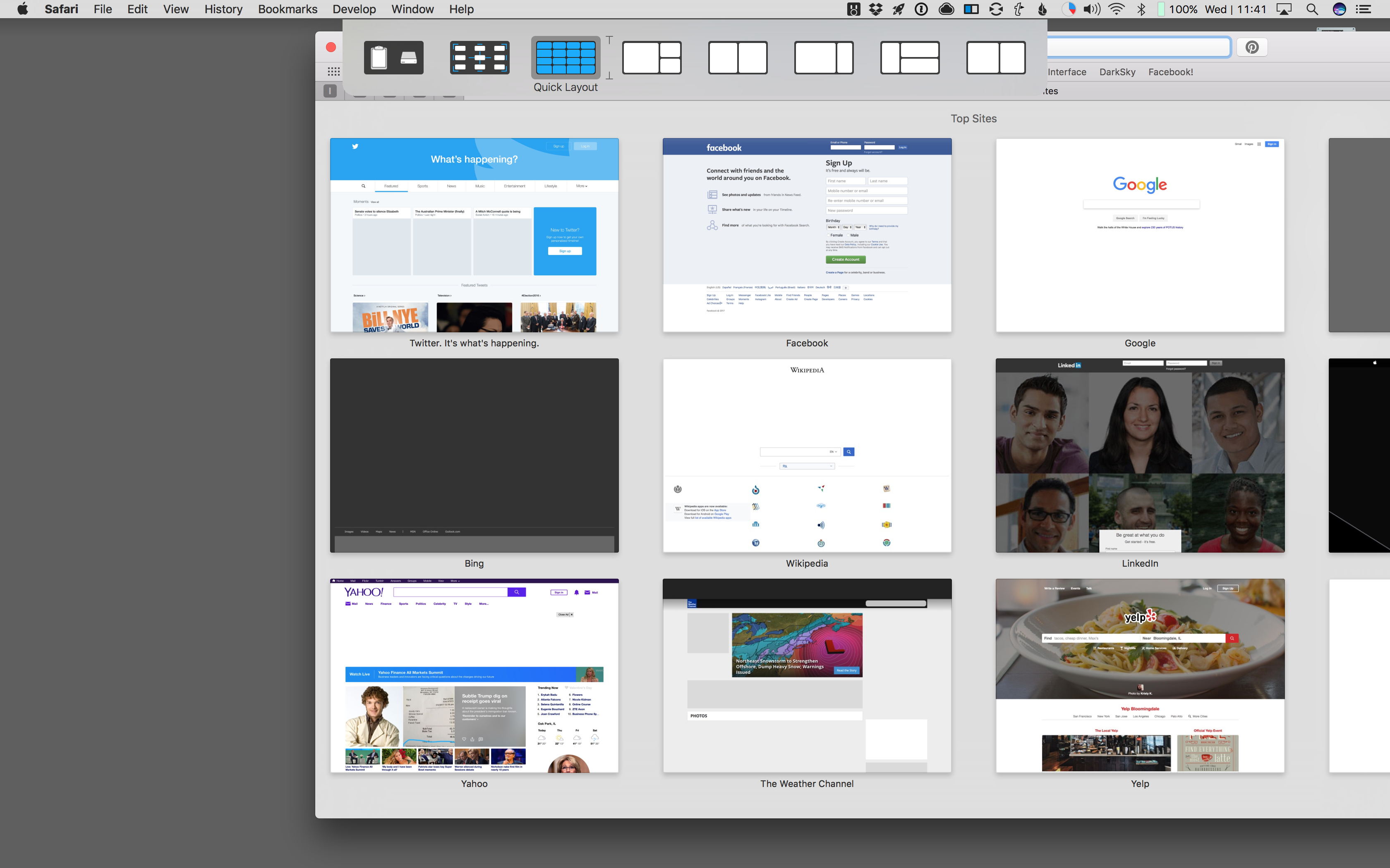
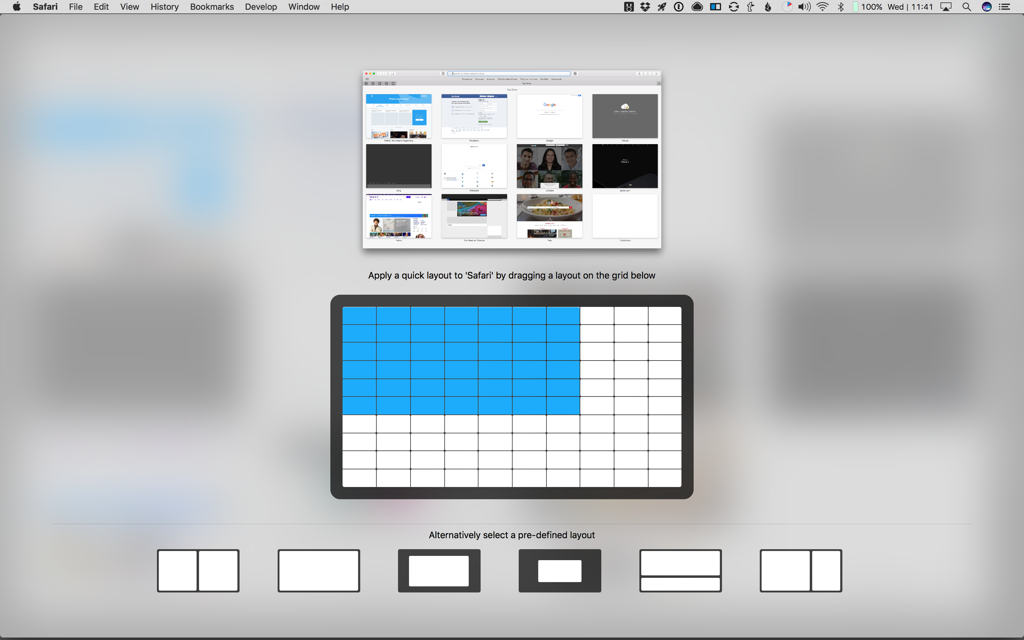
Using the app is super simple. After getting things setup (allowing accessibility permissions for the app to allow placement and sizing), grabbing any app window and dragging it presents you with a a dialog box across the top of your screen. Simply drag your cursor over one of the sizing options, and BOOM, the app is perfectly positioned.

Mosaic Grid Menu
Being one to tinker, I personally adjusted this setting so the option key must also be pressed before the dialog appears. The ability to adjust these settings to better suit your needs is great in Mosaic.

Other options, like “Click and Select” allow a keyboard shortcut to present a layout picker for the currently active application. It also allows for quick access to custom layouts, where you select a section of a grid size the application. This quick customization is fun, and can be useful for larger window apps (like a web browser).
Mosaic Group Menu
Unlike Apple’s current approach to fullscreen multitasking applications (with their full screen and 2 up views), Mosaic doesn’t require the app to support special full screen or side-by-side, but simply needs to be resizable. And if an app can’t be resized, a simple notification lets you know “Hey, something couldn’t be resized because reason“. It’s a delightful experience.
Mosaic Layout Menu
The other big benefit of Mosaic vs the built-in macOS variant is the ability to have 3, 4, 5, or more apps all designated in their appropriate spaces without overlapping or needing to swipe through spaces. On a giant 27″ 5K iMac, this actually feels usable. Huge kudos to the folks at Light Pillar for one-upping Apple.

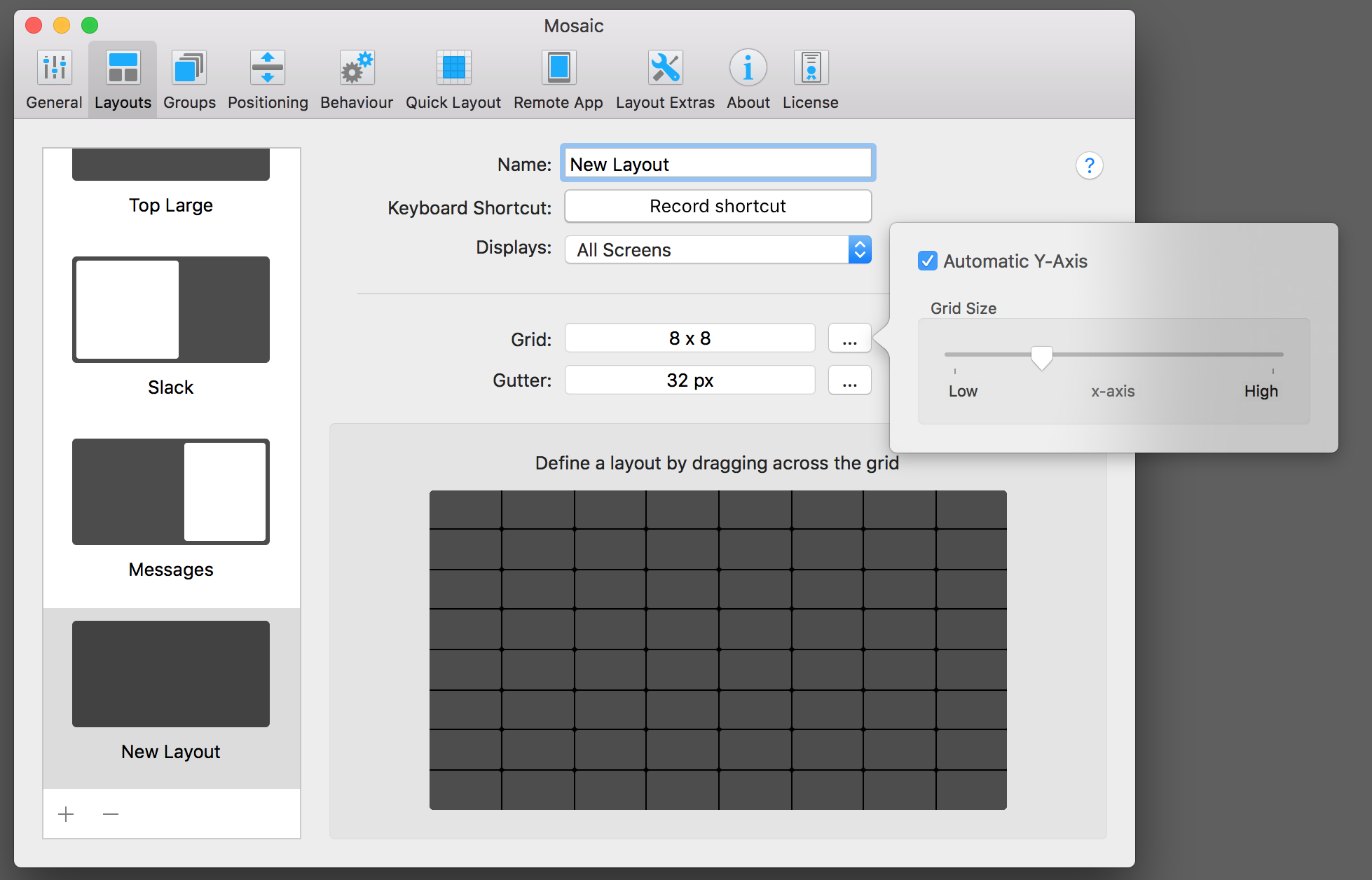
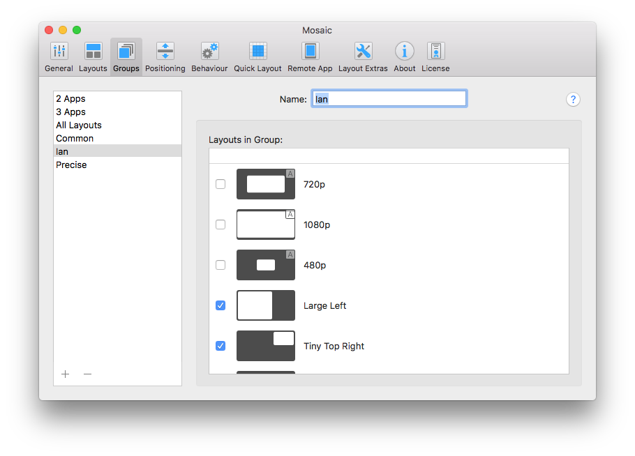
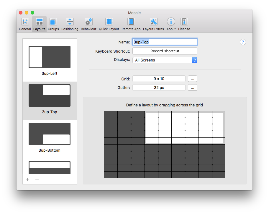
Another great feature of Mosaic is the ability to create your own custom layouts. For me, the first thing I did was make a three-section layout for Tweetbot, Messages, and Slack (since I often bounce around those three when I’m not doing actual work).

Mosaic Custom 3 App Layout
I also setup one for work, specifically to set a browser to ~72% of the screen (5/7), and ~28% for my Remote Desktop client (2/5). Making this layout pairing, and adding it to my group menu has likely saved me 30 minutes in the past month (did I mention this was an OCD thing for me?).

Other great features of Mosaic include a quick positioning option (moving an app to any side or corner of the display without resizing), and options for screen shotting the selected window and saving it to your desktop (or wherever you choose), or grabbing a screen shot and copying the image to your clipboard. These “extra” features are great power user tools, and are super convenient (for me, at least).

Mosaic Quick Grid
The only feature I find currently missing (one I hope the developers add) is an “auto-arrange” that puts all the currently active apps in a pre-determined position. This would save the step of click and drag, and enable a simple keyboard shortcut or click of the mouse to move all my apps to their assigned locations.

Verdict

Mosaic is a delightful utility that solved a problem that I didn’t know NEEDED solving. It has improved my efficiency on my computer by enabling me to spend less time fiddling and more time actually working. As I use it more and more, I find that I miss it when I’m on a computer that isn’t mine. For being a third party application, it feels like a native part of macOS, and I can only imagine it getting better from here!

Rating: 4.0/5.0

Pros:

  • Custom layout templates
  • Easy to use
  • Screen capture & quick layouts

Cons:

  • No auto-layout feature (yet)

If you’re anywhere near as fiddly as me when it comes to the layout and organization of apps on your Mac, Mosaic is hands down a fantastic utility to check out! Get it today from Light Pillar or with a Setapp subscriptions


Disclaimer: This review was not paid for by the developer. Light Pillar did supply a complimentary copy of the app. All thoughts and opinions are my own.

from Ian Fuchs – MacTrast

A Quick Q-and-A about Google Glass

I always enjoy sharing my opinions on technology with friends and family.  Even more so, when someone in public asks me about a device, accessory, app, etc. I always enjoy answering their questions and helping them understand or find something to fit their life.  In the last month, the device that’s sparked lots of questions from friends, family, and strangers alike is my Google Glass (check out my initial impressions of the device).

Google Glass

In the times I’ve taken Glass out in public, I’ve also received a handful of questions about how it works, what it does, and the like. Since Google Glass is extremely new, and relatively rare to see out and about, it seemed only fair to address some of the more common questions that I’ve been asked.

Continue reading “A Quick Q-and-A about Google Glass”

First Impressions: Hands-On With Google Glass – The (Possible) Future of Mobile Computing

We all know (and if you don’t, SHAME!) of Sonny Dickson.  He’s the guy that leaked several dozen photos of the new iPhones and iPads this past fall (with near perfect accuracy, I might add).  Not only is Sonny a super sleuth when it comes to connections in Apple’s production line, he’s also been kind enough to get us, at MacTrast, into the Google Glass Explorer program.

Glass-artsy

After getting invited to join the program, we thought it would be fair to share with all of you, what Google Glass is all about.  Today, we’ll take a look at what comes in the box, and I’ll give a few of my initial impressions.

Before I get to that, though, I will remind all of you that Google Glass is currently in a sort of quasi-open beta program.  Those allowed early access to the product are selected on a invitation basis, and have only seven (7) days from receiving their invite to order their Glass.  I would venture to guess that there are between 10,000 and 20,000 explorers out there right now, but I could be way off (Google didn’t seem to have any real solid numbers publicly available), and that number is growing as Google is in the midst of opening their second string of invites.

Enough about the technicalities though – head over to MacTrast.com for all the juicy details!


WWDC 2013 Predictions

With just over 12 hours until the 2013 WWDC keynote presentation, hundreds (or more) speculations, mock-ups, and predictions have hit the net.

I’m not typically one for making predictions or hypothesizing, especially when I have no insider knowledge of the matter, but I can’t help but speculate what may be on display in Moscone come tomorrow afternoon.

1. iOS 7.

This one is obvious. We know its gonna be called iOS 7 – the banners are up and photos are out. The bigger question is about what it will include.

Looking back at the iOS 4, 5, and 6 announcements (and associated banners), there was always a heavy weighted font and element of realism involved. Now that we’ve seen the slim iOS 7 type-face, I can only assume that we are bound to see a might lighter, smoother, simpler iOS.

I also think Apple is going to reshape the developers aspect of iOS. With recent rumors of AirDrop like functionality coming to
iPhone, iPad, and iPod touches, a much more advanced file structure and true app <> file interaction. Much like Android has offered for years now, the ability to click a photo and open it in any photo editor or send an document from app to app without having to export to Dropbox and move it around would be huge.

2. OS X 9?

While the general consensus is that OS X 10.9 is coming (has anyone else realized that technically the name is them OS 10 10.9?), I’m under the notion that we may see a very new OS X released. While the Mac operating system has certainly changed over time, many elements have remained consistent. It’s about time we see a huge change in OS X, hopefully not at the cost of usability or function. I’d truly like to see OS X 11.

With support for touch screen control (more on that later), more human interaction (Jarvis, look-up iron man 3), and a less hierarchical file system (to coincide with iOS) would all changes the Mac user demographic could make good use out of.


3. New products

I’m in full agreement with Mark Gurman on the lack of new iPad mini (or any iOS device). I could, however, see Apple alluding to new devices in updates to Xcode and app requirements. Support for a new screen resolution could quickly suggest a larger iPhone or higher PPI iPad mini.

Reports say Apple could be looking to AGAIN update the retina MacBook Pro line, which, to me, only makes sense if the update includes touch screen. An updated retina MacBook Air could also be huge for the Apple PC lineup, as well as a retina Thunderbolt Display.

4. The unknown.

Apple’s hobby market, the Apple TV could likely be a show stopper at WWDC, depending on what recent deals Apple may have made and how actively Apple decides to become involved in the future of home entertainment.

Another area of speculation is the iWatch market. If Apple is truly holding the Ace to drop at the end of the Keynote, it could completely reinvent the idea of wearable tech. With devices like the Pebble, Nike’s Fuel Band, and the increasing curiosity surrounding Google Glass, Apple releasing a wrist watch type wearable device could set the tone for yet another new industry (much like it did in the tablet industry with the iPad.

I’m no genius, but it looks like Apple is truly in a unique place that could greatly impact it’s position in mobile market in a matter of a few hours. If Apple fails to deliver significant (desired) changes, it could be a sign that they are losing their edge. Will we see a mass exodus – probably not – but it has become increasingly apparent that the Apple OS platforms have become stale, and developers are anxious to see what changes that will bring to the worlds most advanced computer and mobile operating systems.

It all goes down at 10 AM (pacific) tomorrow, and I’ll be following along as well as I can!

What do you think is to come? Send your best guesses to me on twitter – @IanFuchs, or leave a comment down below!


Why Verizon’s Shared Data Plans Suck

I’ve been a paying Verizon customer for over almost 3 years now (after a brief stint with AT&T after college).  My cellphone contract is the longest standing commitment I’ve had with any company for any thing (aside from my bank accounts).  On top of having the experience of being a customer, I also had the privilege of working for a Verizon Wireless Premium Retailer as one of my first jobs out of college.  Regardless of what money I give Verizon or what experience I have with the company, one things if for sure… THEY ARE TRYING TO SCREW ME .

When I signed on to have Verizon as my wireless provider, my account looked something like this.

700 Min + Unlimited texting: $80.00

Moto Droid (mine): $9.99 + $30 unlimited data

Moto Droid (my wife): $9.99 + $30 unlimited data

Basic phone (home phone) $9.99

Total bill – $170+taxes and fees.

Around year later, we picked up iPhones (when Verizon finally offered it) for our daily phones, and maintained the same basic phone as our home phone… but our bill went virtually unchanged.  We were able to use our iPhones as much as we wanted for texting and surfing the net.  On top of that, our 700 minutes included the unlimited nights and weekends + unlimited mobile-to-mobile calling, so we were using – at most – 150 minutes/month (if I used my phone for work related things).

When “Big Red” decided they were going to jump on the bandwagon of tiered data (no more unlimited – pay more to use more), I gave it a moment of consideration.  With the tiered data plan, I could keep my bill unchanged, but instead of paying the $30 for each smartphone to have unlimited data, each phone would be limited to 2GB/month (that’s what you get for $30).  Verizon even sweetened the pot by offering customers who jumped to tiered data a double-up on their data.  For only $30/line/month, we could pull 4GB of data each (totaling 8GB of data available/month – granted it wasn’t shared).

This didn’t sound like a bad deal… but when I could have unlimited data for $30/month, why would I choose to switch to something that gives me less for the same cost?  Then Verizon started policing usage by “legacy” data plan users.  If you were on an unlimited data plan, Verizon could “optimize” their network, by limiting your bandwidth, to allow more consistent speeds for those on tiered data plans.  This was a huge difference from AT&T’s data throttling, as Verizon would only do this when necessary (like when a specific tower is experiencing higher-than-normal traffic – like at a baseball game or concert).  The potential for Verizon to cripple my iPhones ability to surf the web scared me a little, and I began to think more about the tiered data plans.

A discussion with my wife reminded me that the best deal is the one that gives you the most for the least… stick with unlimited.  And we did.  Then the news broke – Verizon was dumping their 11-month-old tiered data plan options, and switching to a “more affordable” shared data model – Share Everything.  You already share minutes and texts with everyone in your plan, why not share your data too?

because is f***ing expensive.

Verizon’s new Share Everything plans sound really good – when pitched in commercials & by reps.  Verizon will tell you the new Share Everything plan features a couple “attractive” features.

  • Unlimited minutes, shared across all your devices
  • You can have up to 10 devices on your plan – a decent jump from the previous limit of 5!
  • You no longer have to pay extra to use tethering/mobile hotspot on your smartphone  ($20 value)

Verizon also boasts that you get unlimited texting with the ShareEverything (SE) plan, but most people already had unlimited texting bundled in with their minute plans – especially if they’re using a smartphone or have kids (the target audience of the new SE plans).  While Verizon highlights the unlimited texting as another great perk, I don’t see it as a real gain.

Lets take a look at the cost of the new Share Everything plans.  To start with, you choose your devices.  Smartphones ring in at $40/month each – which is the same as what I’m paying now.  Basic phones roll in at $30/month each, so a $20 increase/month from the current basic line cost.  Verizon also throws in hotspots/jetpacks/air cards/etc. for $20/month, and tablets for $10/month.   Where this gets interesting is that you no longer pay for the overall minute plan in the same sense.  You now choose your shared data level, and are left with your total.  The lowest offering is $50 for 1GB of shared data.  Whether you have 1 smartphone or 6, the data remains a shared bucket across all devices. Lets look at what I would get for the same dollar amount I pay now:

 My iPhone: $40

My wife’s iPhone $40

Basic Phone: $30

Unlimited Talk & Text + 2GB data: $60

Total bill – $170+taxes and fees.

Are they for real?  2GB of SHARED DATA! Had I jumped to tiered data when it was a per line addition, I could have 2GB for myself, my wife could have 2GB for herself, and we’d pay the same.  Better yet, with Verizon’s double data deal, we could have have 4GB each for the same cost.  How is this a good deal?  Who does this work for?

This is a good deal for someone.  It has to be… but who?  People who have several lines, constant wifi access for all devices, and spend a lot of time talking on the phone (to non-Verizon customers, during the day).  Seems like that really narrows the scope a bit, right?  Lets say – just for fun, that I ultimately ditch that basic phone and get a tablet instead.  I could move that $30 basic phone down to a $10 tablet price, save myself $20/month?  Fancy that, I can get 4GB MORE of data (a total of 6GB for $80) for that extra $20 and keep my bill the same.  It starts to look a little better here, but I’ve given up a line that can be used to talk or text.  I’m no longer getting one of those “great features” of Share Everything on one of my lines.

Something that doesn’t make sense to me here is this:

  • Mobile phone plans started out offering 50 minutes, no texting and you got billed for roaming (you know, calling outside of the town your phone number was native to).  It was expensive ($60 for 1 line, 50 minutes).
  • A few years later, plans featured larger minute offerings for the same price – or less (500 minutes for $60).
  • Skip ahead a few more years, and plans could include text messaging – again, more for about the same price (US Cellular, AT&T, and Verizon offered 500 minutes + unlimited texting for ~$65).
  • In 2009(ish) – more minutes, unlimited texting, unlimited data, slightly more costly, but a load more capability (1 line with 500 min, unlimited text, and unlimited data = $90).
  • Jump to 2012 – unlimited minutes (which is a useless notion), unlimited texting, and less data… for more money!  Ridiculous.

The mobile industry is screwing over customers more now than ever before.  Is there a good solution – not really.  I’m still holding onto my unlimited data plan.  Verizon says that when you upgrade (and sign a new 2-year contract – which means a subsidized phone cost), all customers on unlimited data are forced to change to a tiered data (for individuals) or shared data (for families) plan.  The only way around it is to pay for the phone at full-retail price.  My hopes of a $200 iPhone are lost, and I assume I’ll be shelling out $650/iPhone in a month or 2 when Apple drops “the new iPhone” onto the market.

At this point, it’s a lose-lose – but if they’re going to attempt to screw me around every corner, this is my tiny way of giving them the finger and taking advantage of being a long-standing customer.

My Hopes for the Future of Mobile Social Media

20120417-162449.jpg

We are in a very rapidly changing time, and experiencing technology that becomes outdated in an instant.  Social media rules the mobile world, and mobile is taking over the way we work, learn, communicate, and document our life. Yesterday’s new social network is tomorrows “old news.”

It seems that every day, a new social platform emerges. Some of these zone in on niche markets – others take on the likes of Facebook and Twitter – while some start in 1 target group and explode into the other. Instagram, for example, was introduced as a way for photographers & fans of analog photography to share and create photographs akin to the days of Poloroid instant develop photos, and will soon be under the wing of the “Big F” – and where that will go, nobody knows.

One social network, launched in November of 2010, has truly caught me by surprise. A social network that combines the ideas of Facebook status, Twitter micro-blogging, photo sharing, and location tagging called “Path” I had seen the occasional post on Twitter with a link back to someone’s “Path”, but never gave it much thought. A few weeks ago, I decided to give Path a try, and to my surprise, the app is so much fun to use.  Path isn’t just another tired social platform. The whole principal behind Path isn’t to share news and links, or to create a network of all your friends. Instead, Path is about sharing your journal, or “path”, of your life on the go. The apps home screen shows a stream of all your friends current paths. Path informs you when your someone has looked at your moment or gone to your profile. It notifies you (if enabled) when your connections post to their Path or leaves you an emoticon (akin to liking a Facebook post). Path isn’t about what happened or what will happen – its about the NOW – and about sharing as you are out-and-about!

20120417-1621311.jpg

What makes Path most interesting to me is that it has such a visually and aesthetically pleasing interface, and it’s one of the smartest social networks I’ve ever experienced. Path learns from your post habits. When you launch Path in a new neighborhood, it automatically posts the your location has changed to whatever city/village/area you are in.  I went to a White Sox game with my wife, for example, and as I got to my seat, I launched Path – and there it was “Ian : In Bridgeport, Chicago”. Of course, I can then hone in on where exactly I am, and upload a photo. In a matter of seconds, I can tap the (+) button in the bottom corner, tap the camera icon, snap a picture, choose my location – U.S. Cellular Field, tag my wife under “I’m with” and click done. The smooth and inviting interface makes sharing fun and enjoyable.

Path has a number of other excellent features. I suggest that if you’re looking for that social space that’s personal, semi-private, and beautifully designed, then you check out Path [app store link]. I hope other social networks can take note of Path’s unique and seamless UI, and *smart* updating, it could truly change the social networking game.


The iPad 3 – Announcement-Day Eve

this post was inspired by the mashable article “What if everything we think we know about the next iPad is wrong”

With all the off-the-wall speculation, rumors, claims, “insider” details, and the like – I figured it was my turn to share some insight into what I believe the next generation iPad will include.

Reports have claimed things like a lack of home button, 4G/LTE connectivity, a super hi-res Retina display, iOS 6, a new moniker (iPad HD), a new price point, and so much more… but here’s the truth in what to expect.

On Wednesday, March 7, 2012, Apple will release the ePad (as a throwback to the old eBooks & eMacs). The ePad will be a 7.5″ Windows 8 tablet with a surprisingly low resolution (similar to the 1st generation iPod Touch). It will come in 1 size – 4GB. It won’t have 4G/LTE… or 3G for that matter. It will only be available with WiFi – but limited to WiFi 802.11 a/b… no 802.11 g/n. This tablet will form a new partnership between Apple and Microsoft that will allow Apple to slowly start a downward spiral.

In all likelihood, Apple won’t release a new iOS ever again, and will soon shut down the App store all together to push for more HTML5 based web-apps & will use the Windows marketplace as their sole distribution center.

The likelihood that Apple will drop the home button is not likely, and I assume that Apple will actually throw back to the original iPod (remember that one… with all the buttons… yeah… that one…) and will have a button to perform nearly every normal function on the device. The device will no longer be touch sensitive as a way to make room for the Serial ATA hard drive and the hatch for the D-cell batteries. Apple will also limit syncing to a new cable, only available to customers for use within Apple retail locations, with a Genius appointment. These cables won’t be sold in to consumers, which will further strangle Apple as a company.

All of this great new technology and these fantastic new features will be available immediately after the announcement event at the startling price of $189.99 (to compete with the Kindle Fire).

So what do you think? Will you be picking one up? I know I’ll be 1st in line!


P.S. This is all sarcasm… just want to point out how RIDICULOUS some rumors can be… how 1 person saying some is from a credible source can really spin things out of control.

Tomorrow will be another fantastic event, and I seriously can’t wait to see what Apple has in store for us. My prediction is just as good as any – but I’m guessing the following

  • Retina display
  • WiFi/3G (AT&T, Verizon, Sprint, Unlocked)
  • (Maybe) 4G-LTE
  • Possible elimination of the home button for touch sensitive buttons (similar to many Android devices – or better yet, Palm style touch area)
  • 16/32/64 GB options
  • I don’t foresee iOS 6, since 5 is so new… maybe some big new features in a 5.3 (similar to 4.3 from 4.1?)
  • No change in price, although the iPad 2 may drop in storage size (like the iPhone 4 did when the 4S was released) and the iPad 2 would be come the “affordable” version

Anything else Apple gives us in the new iPad will be a surprise to us all… tomorrow will tell!

The Next Wave of Classroom Technology

The following feature article was written for Waldorf’s “The Torch” quarterly magazine.  See the original article here!

We are living in very an unique time. It is a time where teenagers carry smartphones, college students live on their laptops, and jobs are centered around email, texting, and video conferencing.  For those who are behind or feel it is too hard to learn now – the world around them seems to be evolving faster than ever… and IT IS.

Graduating college just over 2 years ago, I was on the cusp of what is now somewhat of a technological revolution.  Since 2008, the adoption of smartphones has more than doubled for adults to an impressive 35% – and that number continues to grow.  A study by Pew Research Centers puts 18-24 year olds at an astonishing 49% using smartphones, and 58% of 25-34 year olds. So what does that mean? Nearly half of all college-aged students are carrying a smartphone – and it’s effecting how they learn. Continue reading “The Next Wave of Classroom Technology”

Review: Kurt Cobain’s Graphic Novel meets the Digital Realm (iPad App)

The iPad, for me, is a web browser, a productivity tool, and a way to consume visual media.  When I was tasked with checking out “Kurt Cobain: The Graphic Novel,” I was skeptical as to how it would fit into my typical iPad use – but I’m glad I gave it a try.

Downloading the app (available here) was a fairly painless process, although it does take a little time, even over wifi, due to the applications size.  The App Store requests the user to be 17+ in order to download, as the novel does contain some “R” rated (violence, drug use, sex, depicted suicide) content.  The $5.99 price tag was also relatively easy enough to swallow, especially for a Nirvana fan or comic book enthusiast.  The story takes you through the life, fame, and death of Cobain, in a unique and extremely visual 84 pages.

Overview: At first launch of the novel, you’re greeted with a comic book illustration of Cobain, with angel wings, on his knees crying, which very quickly establishes that this is the digital version of “Godspeed” – the print version of the Kurt Cobain graphic novel.  The home screen is optimized for both landscape and portrait viewing modes, but that doesn’t extend to the pages of the novel.  From the home screen, you can jump right into the comic, although there are a few other options (intro, help, about, etc).  There is also a light guitar riff that plays on the menu.  Enjoy it, because it’s the only sound included in the app. Clicking “enter” springs the comic open, and you’re immediately swept into the comic’s artwork by Flameboy.

To me, this feels like a real comic book, and, in my opinion, it is a truly brilliant use of the iPad’s screen.  They say a picture is worth 1,000 words, and this graphic novel holds true to that.  The art work is dark, detailed, and tell most of the story by it’s self.  A simple double tap of the screen on any of the tiles will bring it full screen, and from there, users can swipe left or right to read it frame by frame.  This feature makes the digital version stand out over the print version and really improves the experience as a reader.


Verdict: Reading the novel, to me, almost felt like I was watching it on TV.  I found myself getting somewhat lost in my own imagination as I slid from one image to the next.  A soundtrackto the novel would have made it truly interactive, although the experience can be enhanced further by loading your iPad music library up with a handful of Nirvana tracks, and letting the music help set the mood of the graphic novel.

Comics and graphic novels are definitely a market that can utilize the iPad as a tool to further their reach, and “Kurt Cobain: The Graphic Novel” is a prime example.  If you’re into Nirvana/Kurt Cobain, or know someone who would really enjoy a digital comic, I recommend you check it out in the App Store… it’s worth it!

Rating: I would say that “Kurt Cobain: The Graphic Novel” is a 3.5 out of 5.

Pros:

  • Illustration Quality
  • Frame by frame content viewing
  • Like reading a ink and paper comic book

Cons:

  • Lack of audio content
  • Lack of true landscape version
This review was written by me, as a guest writer for Mactrast.com

Check out the original post HERE!!